Case study · Power BI · Synthetic data
FinOps dashboard for NovaRetail Cloud
A synthetic Azure cost analysis built to demonstrate how I structure a Power BI report: executive KPIs, ownership breakdown, service prioritization and resource-level drill-down.
What the dashboard answers
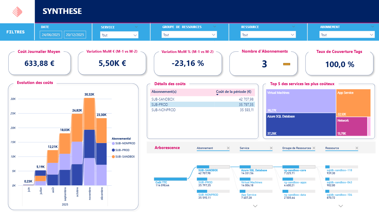
The report is designed as a one-page FinOps synthesis. It helps a stakeholder move from high-level cloud spend to concrete technical objects that should be investigated first.
Main signals
- Average daily cost: 633.88 EUR.
- Month-over-month variation: 5.50K EUR and -23.16%.
- Scope: 3 subscriptions with 100% tag coverage.
- Period cost: 114,098.44 EUR visible in the decomposition tree.
The key signal is not only the total cost. The dashboard shows that the sandbox subscription is the most expensive area, which is exactly the kind of anomaly a FinOps review should surface.
Cost trend
The stacked monthly chart shows a strong ramp-up from summer to November 2025, then a lower December. In a real review, I would investigate whether this came from a project phase, migration activity, non-production resources left running, or incomplete period data.
The stack by subscription matters because it separates the total trend from ownership. The analyst can see whether production, non-production or sandbox environments are responsible for the movement.
Service prioritization
The treemap makes the optimization order clear: Virtual Machines and Azure SQL Database dominate the spend, followed by App Service and Network. That prevents a team from spending time on minor services while most of the bill sits in a few large categories.
Resource-level drill-down
The decomposition tree is the operational part of the report. It follows the path:
Cost TTC -> subscription -> service -> resource group -> resource
That makes the dashboard useful for both finance and engineering. Finance sees the cost allocation, while engineers can identify the exact resource to inspect.
Power BI skills demonstrated
- KPI cards for executive steering.
- Stacked monthly cost evolution.
- Subscription-level allocation table.
- Treemap for top service prioritization.
- Decomposition tree for hierarchical investigation.
- Slicers for date, service, resource group, resource and subscription.
- Consistent formatting, currency display and readable French labels.
Production extensions
In a real client version, I would add budget vs actual tracking, forecasted month-end spend, anomaly detection, idle resource recommendations, reservation opportunities, tag quality by owner and refresh monitoring.